2D Art
Six-Value Colour Web Project
"It is only after years of preparation that the young artist should touch colour - not colour used descriptively, that is, but as a means of personal expression." - Henri Matisse
"Colour is a means to exert a direct influence on the soul." - Wassily Kandinsky
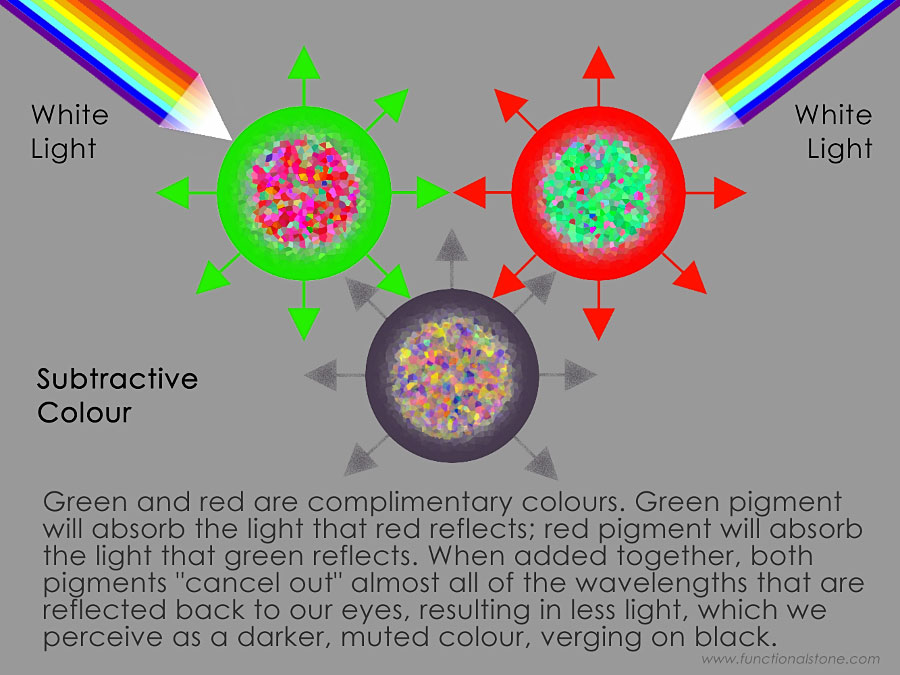
Subtractive Colour Theory
Colour is arguably the most powerful, emotive and complex of all the art elements. It has a fascinating history. Medieval and Renaissance artists would get very excited about the "latest" colours that chemists created (like vermilion) and they would use these new colours over and over again in many of their paintings. Some of these colours were so rare and so desirable that they cost more than gold! Here's a fascinating three-part series of pod-casts about it, courtesy of the Canadian Broadcasting Corporation:
The Power of Colour
Perhaps the most important thing to remember about colour is that it's all about light. The white light that falls on the earth is comprised of visible and invisible (to us) wavelengths. Although the sun generates a wide range of electromagnetic radiation (beyond infrared on one side of the visible spectrum and beyond ultra-violet on the other side), the human eye is capable of perceiving only a narrow band: the rather limited range of colours (but still numbered in the millions) that corresponds to wavelengths from approximately 400 to 700 nanometres.
Our ability to perceive colour depends on three types of photoreceptor in the human eye (called "cones"), which happens to be a trivial number compared to some other species, like the Bluebottle butterfly. This insect has a whopping 15 types of photoreceptor, allowing it to differentiate among innumerable colours and to see well into the ultraviolet spectrum.
The human eye probably developed its ability to perceive colour (as it does) to ensure survival for our ancestors. We are the descendants of savannah-dwelling primates who had to be continually on guard for predators. The animals that might have hunted our ancient ancestors were probably stealth-hunters: like large, carnivorous cats that hide in the tall grasses until an unlucky prey animal wanders within striking distance. It would therefore have had tremendous survival value for our ancestors to be able to spot danger lurking in the tall grasses. This might explain why the human eye is so exquisitely able to differentiate more shades of green than almost any other animal on earth.
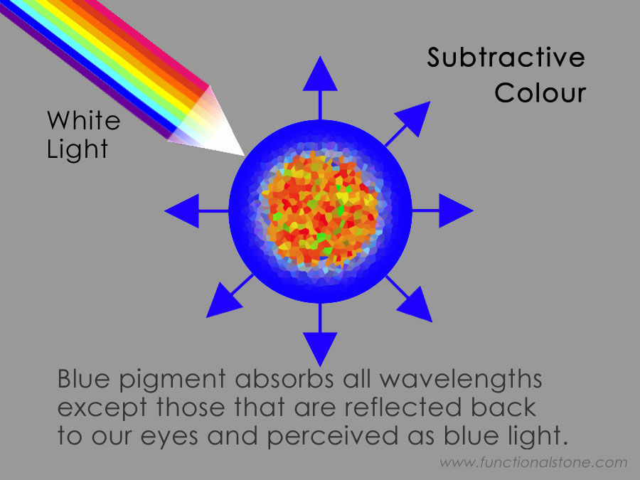
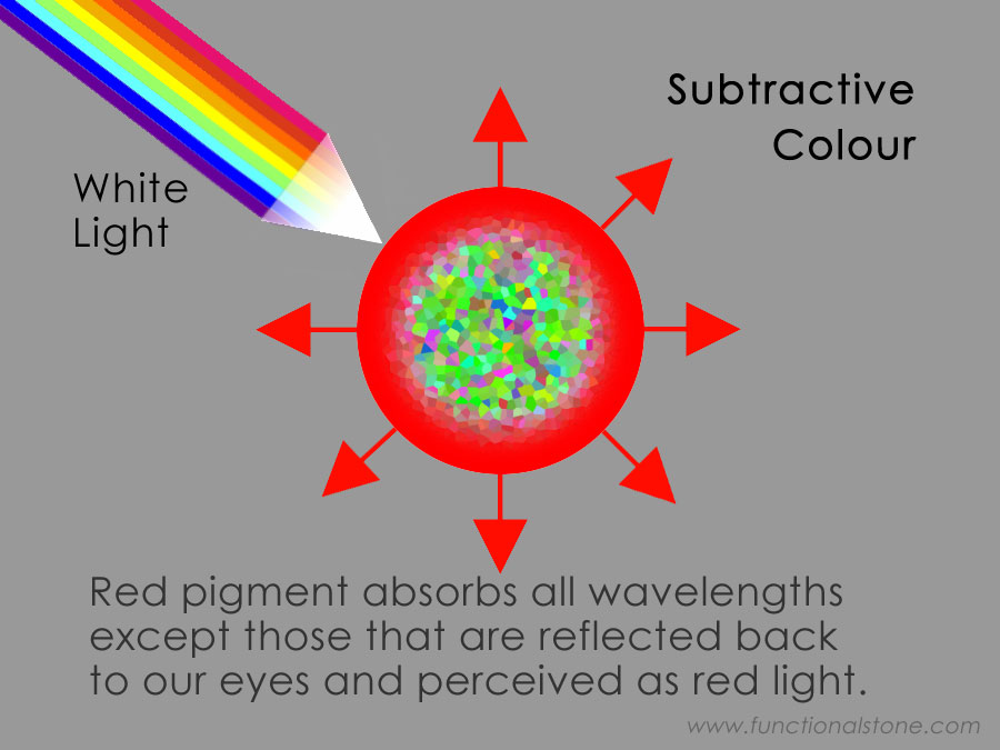
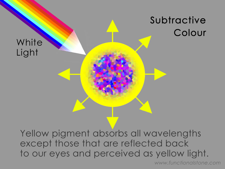
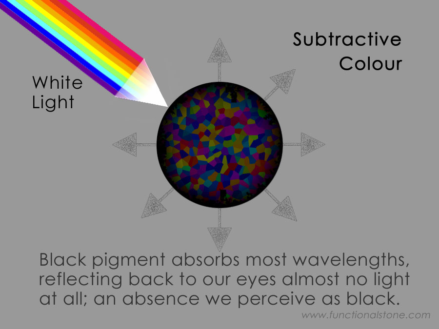
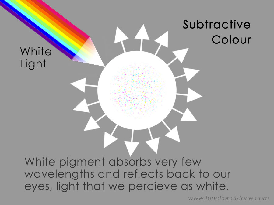
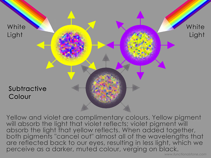
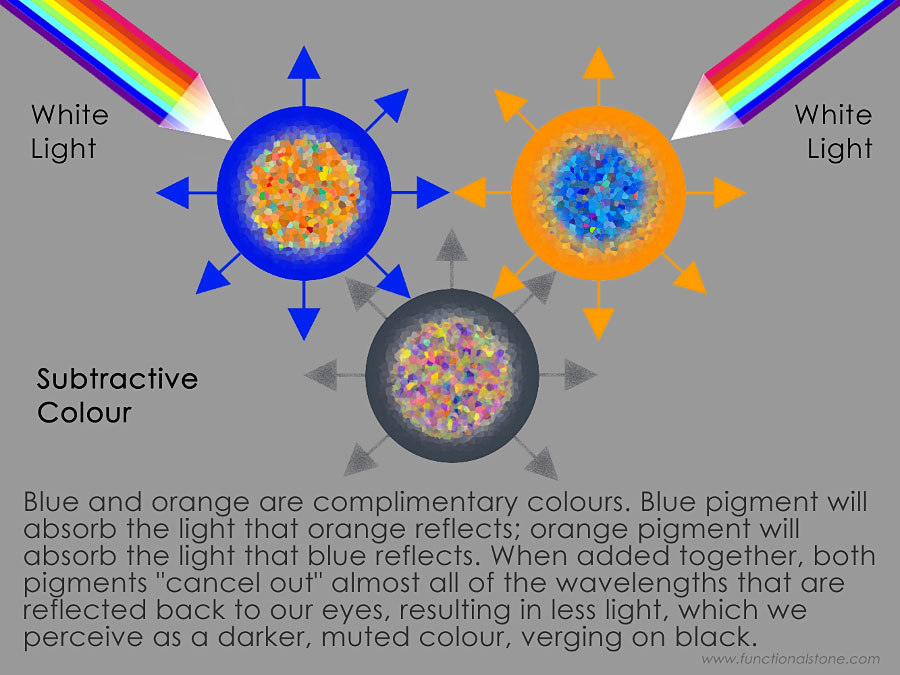
The way that subtractive colours work is pretty simple, but needs a bit of explaining... When white light (which is comprised of all colours) falls on an object, it will be partially absorbed and partially reflected. The amount of absorption and reflection will depend on the object's surface. In essence, when certain wavelengths are absorbed by a material, those wavelengths will be absent in the remaining light that's reflected back to the surrounding environment: a red object appears red because its surface doesn't absorb red light; a blue object appears blue because it doesn't absorb blue light; and so on.
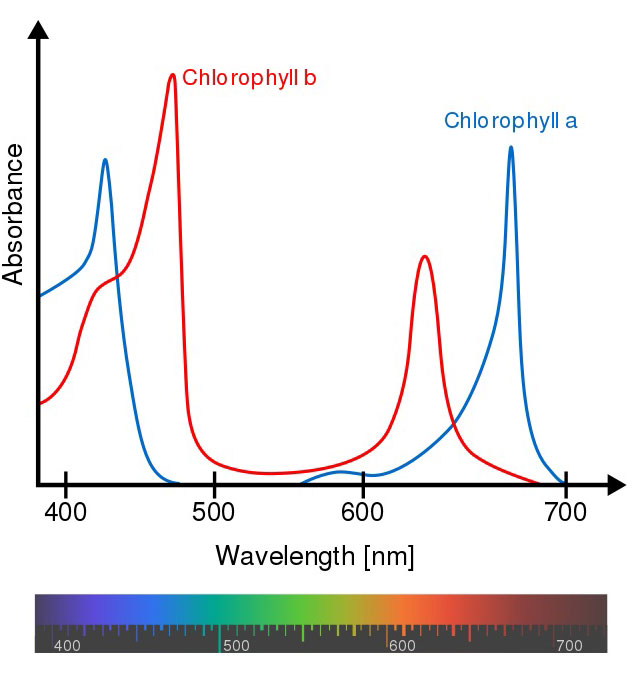
The leaf of a tree, for instance, absorbs most of the ultraviolet-to-blue and orange-to-infrared parts of the visible spectrum, which are the most useful wavelengths (see the chlorophyll spectra illustration). The leaf has evolved an ability to absorb these parts of the spectrum by producing a green substance called chlorophyll. Without going into too much detail, chlorophyll enables photosynthesis to take place so that the leaf can convert sunlight into energy. The green and yellow parts of the visible spectrum are not very useful for this task and so those wavelengths are reflected away from the leaf and into the surrounding environment. This is why all chlorophyll-producing plants appear green and yellow-green.
How Paint Works
The mechanism that gives paint its colour is exactly the same as it is for the chlorophyll in a leaf: some parts of the visible spectrum are absorbed by the pigment in paint and other parts are reflected back into the surrounding environment. The wavelengths that are absorbed (or reflected) depends on which minerals, dyes, chemicals and other compounds are present in the paint. Iron oxide, for instance, contains oxidized iron (rust), which gives the paint a warm, reddish-brown colour. All wavelengths of light, except those that appear reddish-brown, are absorbed by iron oxide.
Many pigments are derived from natural sources, mostly minerals and metals - titanium dioxide and zinc oxide (white), carbon (black), chrome oxide (green), cadmium (yellow, orange and red) and cobalt oxide (blue) - but others are synthetic and must be produced by combining chemicals with minerals and metals. For instance, a mixture of iron(III) chloride (FeCl3· 6H2O) and potassium ferrocyanide (K4[Fe(CN)6]· 3H2O) will produce Prussian Blue pigment, which can then be mixed with linseed or walnut oil to make oil paint; mixed with a polymer medium to make acrylic paint; mixed with egg yolk to make egg tempera paint; or mixed with gum arabic to make watercolour paint.
More than a few of the colours that artists have prized over the millennia have proven to be extremely toxic, such as flake white (made with lead), vermilion red and cinnabar (both of which are made with mercury). Some art historians have suggested that the toxic effects of paint contributed to Van Gogh's struggles with his mental health later in life. There's some comfort in knowing that many of the most dangerous colours from Van Gogh's era have been replaced with less toxic alternatives.
In addition to crushed and highly-refined minerals, most artist-quality paint will also contain dyes, solvents, binders, emulsifiers, extenders, oxidizers, plasticizers and polymers. These substances give the paint its characteristic colour, viscosity, plasticity and durability.
Depending on whether it's water-based or oil-based, all paint will dry and harden by means of at least one of several processes: oxidation (oils), cross-linking polymerization (acrylics and latex) or evaporation (watercolour and most inks).
I've barely scratched the surface here; you should do more research for the specific paint that you're using by browsing the manufacturer's website and, if possible, requesting a Material Safety Data Sheet (MSDS). Some paints are much less toxic than others, so the more research you do about the potential hazards of your paint, the better prepared you will be to make good choices.
Project Description
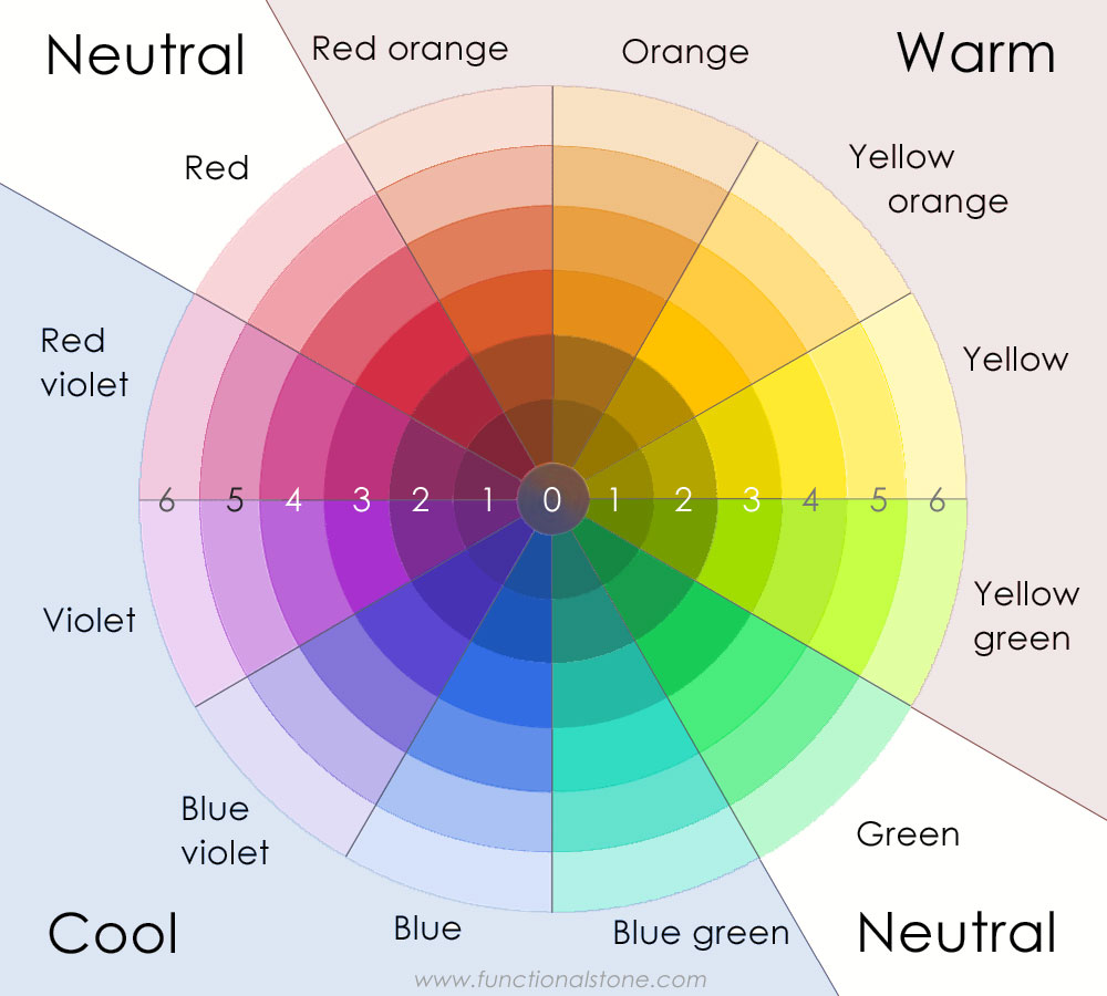
PROCEDURE: On a full sheet of Fabriano Academia paper, make a subtractive colour web that contains primary colours (red, yellow, blue), secondary colours (orange, green, violet) and tertiary colours (red-orange, yellow-orange, yellow-green, blue-green, blue-violet, red-violet). Each colour must be mixed with its compliment or white to produce a range of six distinct values, from the lightest tint to the darkest shade.
The lightest value, called a tint, will be located on ring 6 of the web. The darkest value, called a shade, will be located on ring 1 of the web. The centre disk is reserved for neutral grey (it will appear almost black) and is made by mixing any two complimentary colours (those that are on opposite sides of the web) together in equal proportions. Red and green seem to be the best complimentary colours with which to make neutral grey because they are also neutral in terms of being neither warm nor cool.
DO NOT use black paint to make darker shades! There are dozens of formulations that make black paint either warm or cool and rarely neutral. Using black to make a darker shade will lead to muddy and inconsistent results because you're not only cancelling out a specific colour, you're also adding MORE of that colour to your paint.
For example: black paint contains red AND green, so adding it to red paint (in an attempt to make a darker shade of red) will INCREASE the amount of red pigment that's present in your paint, thereby making it too red and no longer neutral. To correct this mistake, you will have to add a little extra green pigment. The danger, of course, is that it's very easy to add too little or too much green, which means that your colour will invariably shift in an unpredictable way. This is true whenever black is added to any primary or secondary colour.
AESTHETIC: Make your colours as exact as possible. If you mess up while mixing a colour, don't spend a lot of time and energy trying to correct your mistake; instead, begin afresh. You may find it helpful to purchase a colour wheel to use as a reference. As the values transition from lightest to darkest, each value must be clearly discernible from the other values around it and must also be proportional so that the incriments appear to be regular and smooth. The paint surface does NOT need to be perfectly smooth (as if made by an ink-jet printer); brush marks and textures are acceptable, but the edges where a colour ends must be kept clean and sharp (with painter's tape).
Example
TECHNICAL: Use painter's masking tape to keep your edges clean and sharp. Mix plenty of colour so that you don't run out in the middle of a section. Paint the primary colours first; secondary colours second; and tertiary colours last. Use acrylic medium (high gloss or medium gloss) to extend your paint and to make it more workable.
Note
Many of the pure hues (the way most colours appear when used straight out of the tube) will occupy ring 3, but with a few exceptions: Violet, blue-violet and red-violet are naturally dark hues (some painters substitute violet for black in their paintings). Depending on how dark your violet paint appears (some brands have more pigment, which can make them darker), you will probably have to place the pure hue(s) on ring 2 instead of ring 3. You will then mix 4 lighter tints and 1 darker shade for each of these colours. Likewise, yellow is a naturally light hue and should be shifted in the opposite direction. The pure hue would then sit on ring 4 surrounded by 2 lighter tints and 3 darker shades.
Terminology
- Hue: a family of related colours - vermilion and crimson are red hues; navy and cerulean are blue hues; lemon and saffron are yellow hues; and so on.
- Colour: the name that we use to describe the appearance of a specific set of electro-magnetic wavelengths - yellow corresponds to wavelengths from about 560 to 590 nanometres (nm); orange is 590 to 635 nm; red is 635 to 700 nm; and so on.
- Saturation: the amount of pigment that's present in a colour - 1 part yellow added to 9 parts medium makes a colour with a low saturation of yellow compared to 5 parts yellow with 5 parts medium.
- Chroma (similar to saturation): the relative saturation of a colour - grey-green has low chroma; grass-green has high chroma.
- Value: the relative lightness or darkness of a colour.
- Tint: the lightness of a colour - pink is a tint of red.
- Shade: the darkness of a colour - brown is a shade of orange.
- Tone: an arbitrary midway point between a tint and a shade - middle grey is a tone between black and white.
Further Research
I would recommend these excellent videos about art:
- Van Gogh's Ugliest Masterpiece (The Nerdwriter, 2019 | 7m 23s)
- 10 Best Uses of Color of All Time (The Nerdwriter, 2017 | 13m 00s)
- Understanding Color (The Blender Guru, 2014 | 23m 13s)
- Colour Harmony: 10 Minutes To Better Painting, Episode 5 (Marco Bucci, 2017 | 10m 20s)
- Whitescapes - Odili Donald Odita (Art Assignment, Season 3 Episode 29 | 10m 56s)