2D Art
Rule of Thirds & Crash Points (Compositional Sweet Spots)
"Art is the imposing of a pattern on experience, and our aesthetic enjoyment is recognition of the pattern." - Alfred North Whitehead
Theory
Almost everyone makes the same mistake when they first begin composing drawings, paintings and photographs: that is, to place the focus of the work (the most important part of the subject matter) in the centre of a composition. At first glance, this placement seems to make sense because the geographic centre is the farthest, mostly equidistant point from an image's edges: a seemingly privileged position that imbues this area with a tremendous amount of power. Quite naturally, a central focus (often found in radial compositions) will draw a viewer's attention inward and away from the "boring old edges" of an image and toward a place where we expect to find all of the most interesting parts of an artwork.
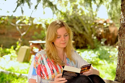
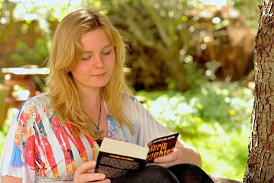
Several problems arise whenever we put something right smack in the centre of a composition. Notice in the first image, that our gaze is instantly attracted to the reader's face, which occupies a privileged position in the centre of the photograph. Our attention settles there, becoming trapped and unable to easily roam from the centre of the work. This bull's-eye-like placement might be appropriate for a radial composition, but it will always make it difficult to explore any part of the image that's beyond the centre and the nearby area that surrounds it. In fewer words, a bull's-eye impedes movement.
We've already learned that movement is an important Principle of Composition, so we must be attentive to its presence in an artwork. An obvious remedy for correcting a bull's-eye is to move the area of interest (or emphasis) away from the centre. When we allow the centre to remain empty (or, inhabited by fewer and less important elements), we avoid its tremendous holding power. By doing so, the viewer's gaze is released, allowing her to more easily explore the rest of the composition. There's now much less chance that the eye will become trapped by a "compositional black hole". A question arises: if we cannot use the centre, then where should we put our focus?
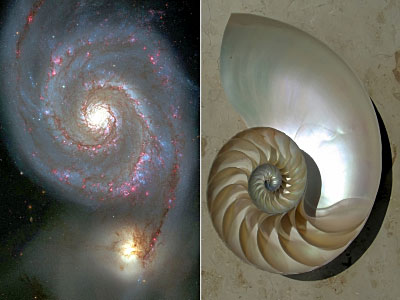
When we consider the overall surface area of the image, there seems to be a plethora of random locations in which to place the focus of a composition. How then do we narrow our options or identify those spots that are most effective? At times like this, it's wise to remember Rembrandt's advice, "Choose only one master: Nature". Claude Monet also had some very good advice when he suggested that, "It's on the strength of observation and reflection that one finds a way." When we look to nature for guidance, we notice that certain patterns seem to recur with astonishing frequency. Perhaps the most ubiquitous of these patterns is the humble spiral.
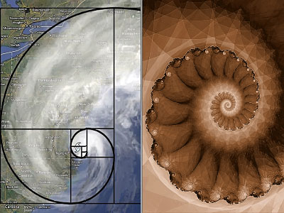
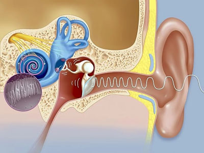
Spirals occur everywhere, from the smallest objects on earth - plants, snails, virus - to the largest structures in the known universe: galaxies comprised of hundreds of billions of stars. Not only does the spiral establish a pattern for natural growth in plants, animals and cosmic phenomena, but it also appears in the mathematics of fractal geometry; in seemingly random phenomena, such as hurricanes and tropical cyclones; and is even found within the human body, most notably, in the shape of the cochlea of the inner ear (the word cochlea is derived from a Greek word that means "snail").
Golden Ratio
"Look deep into nature, and then you will understand everything better." Albert Einstein
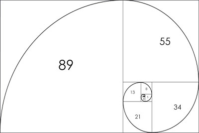
Let's take a moment to play with numbers and shapes... If we begin with a rectangle and then divide it into ever-smaller squares, we find that a spiral will intersect all of those squares at opposite corners (see the illustration below).
Fibonacci Series
"The most beautiful thing we can experience is the mysterious. It is the source of all true art and science." - Albert Einstein
We've known about a mysterious number, 1.61803398875, for quite a long time and refer to it as the "Golden Ratio". Also known as the Golden Mean, this fascinating ratio can be expressed as a numerical sequence if we multiply it by whole numbers, rounding up or down (as needed) to arrive at the next natural number. Starting with 1, our series would look like this: 1, 2, 3, 5, 8, 13, 21, 34, 55, 89, ...∞.
If we now include a "0" and another "1" at the beginning of our sequence, it becomes a simple algorithm known as the Fibonacci Series or, the Fibonacci Sequence. Notice how each number (beyond "0") — 0, 1, 1, 2, 3, 5, 8, 13, 21, 34, 55, 89, ...∞ — is equal to the sum of the preceding two numbers.
Leonardo Pisano was born in Pisa, Italy in 1170 CE and became known as Fibonacci. This Italian mathematician achieved renown not because of his algorithm but by modernizing European commerce. At that time, Europeans had been using Roman numerals for generations. Fibonacci, the son of a merchant, often accompanied his dad on business trips where he learned about the superior Hindu-Arabic system.
Later in life, Fibonacci wrote several books that illustrated how the Hindu-Arabic place-holding system (where each column to the left increases by a power of 10) could make calculations much easier and faster, thereby improving the efficiency with which commerce was conducted amongst producers, merchants and record keepers (i.e., accountants).
If you have any doubt about the superiority of one system over the other, try solving this equation using Roman numerals: MXVII x V = ? Now try solving it with Hindu-Arabic numerals: 1,017 x 5 = ? (answer = 5,085).
European commerce flourished soon after it adopted the Hindu-Arabic system. I would go even farther and suggest that our global economy, international commerce and even science, engineering and technology (really, anything that relies on the manipulation of numbers) would be mere shadows of their present forms if not for the elegance and simplicity of the Hindu-Arabic numeric system.
Sweet Spots, Power / Crash Points
"Good composition is like a suspension bridge - each line adds strength and takes none away." - Robert Henri
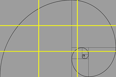
Returning to our spiral and squares, if we now overlay a grid on top of the spiral, we discover that no matter which way we flip it, the tightest part of a spiral will always coincide with a 2 x 3 grid at intersections of one third by one third (up or down, left or right). A prime location for placing the focus of a composition is located at any of these four intersections, which are called "sweet spots", "power points" or "crash points".
Of course, we need to be careful not to overdo it by placing a visual element at each and every sweet spot within a composition; to do so will dilute their power.
Rule of Thirds
"Everything must work in concert. Composition is important, but so are many other things, from content to the way colours work with or against each other." - William Eggleston
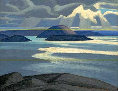
Here, we arrive at the "Rule of Thirds". In a landscape, like the sketch of Lake Superior by Lawren Harris (see the image above), the Rule of Thirds can be used to organize space. The horizon-line would then be located one third from the top or the bottom of the composition, depending on the desired proportions of the foreground, the mid-ground and the background (or, more simply, the balance between land and sky).
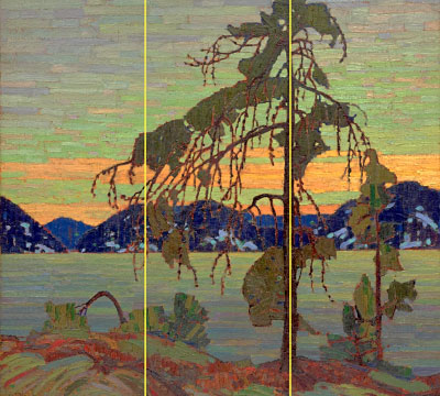
An artist may also use the Rule of Thirds to position vertical elements in a composition, as Tom Thomson seems to have done with the foreground tree-like shapes in his beautifully atmospheric painting titled, The Jack Pine.
In the last image, the reader's face occupies the upper left sweet spot, thereby creating a composition that doesn't trap the viewer's gaze. Sweet spots are an effective tool for facilitating movement, which feels natural and aesthetically pleasing. Take a moment to click on this image and then click the arrow (on the right-hand side of the image) to compare it to the first photograph on this page.
By organizing a composition according to the Rule of Thirds and by using sweet spots, we can create artworks in which the geographic centre remains empty, or inhabited by fewer and less important elements. The viewer's gaze is no longer hampered by a bull's-eye; it roams the composition effortlessly, moving from one area of interest to another and then returning to the focus of the work at any time that we desire. The image is now easier to explore AND more pleasing to the eyes.
